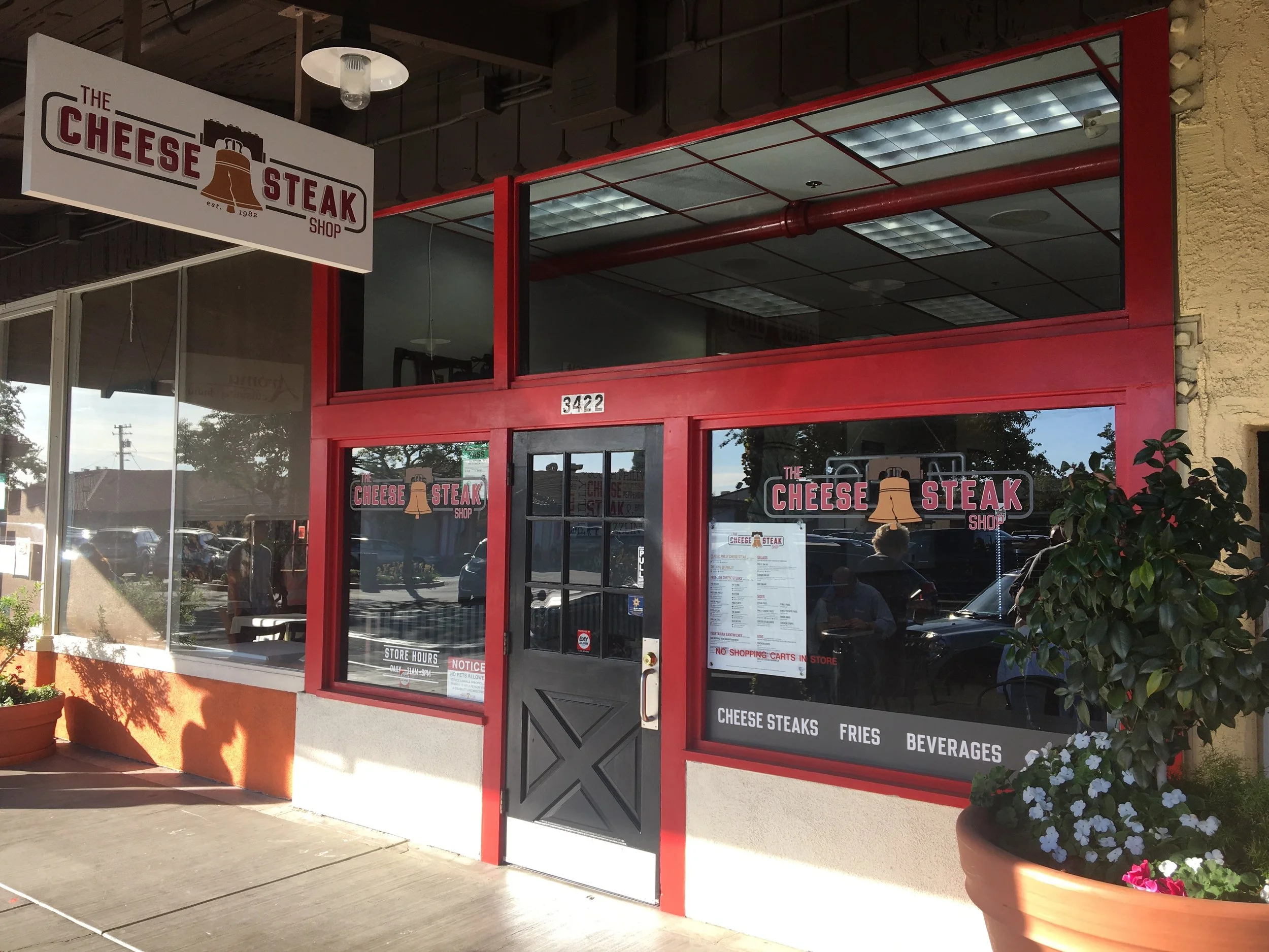
The Cheese Steak Shop
Long time client of Overstreet Associates, The Cheese Steak Shop—an iconic Bay Area staple & restaurant founded in San Francisco in 1982—changed ownership and wanted a full rebrand. 35 years after it was founded, I had the honor of rebranding the entire franchise restaurant, top to bottom. Taking great care to stay true to their roots and history, I was able to marry the core brand with a unique contemporary look that stands tall and competes in the new crowded industrial-contemporary food space industry.
Roles: Lead Designer / Art Director
Timeline: 7 months [First Concept – In-Store Launch]

THE BEGINNING
My Creative Director and I put together several logo/concepts. CSS picked one of the logo/concepts I put together. After a couple rounds of revisions and looking at the 2 logos you see below. With the clients feedback in mind, I tried visualizing various assets yet to come and felt strongly about having a versatile logo that worked in tandem with the artwork where it would be placed. As such I offered the concept of having a Gold Logo for lighter backgrounds and a Silver Logo for dark backgrounds. With the client thrilled I set off to give the franchise a full top to bottom contemporary rebrand. Unbeknownst to me, this would be the biggest challenge of my career and after it’s completion, my proudest accomplishment.
Final lockups — GOLD & SILVER

Logo versions
BUSINESS

BRAND GUIDELINES

TRIFOLD MENU


Menu Screens
I used the trifold & digital menu design as my muse to drive the entire look and feel of the brand. The menu design presented me with several challenges. Due to the amount of food items, complexity of ordering and the new laws enacted in CA requiring calories to be listed for each sandwich variation, I knew it would be text heavy. Simplicity in design is always important, with this in mind the icons for the Steak & Chicken were born. But my challenge didn’t stop there, the client wanted the Classic and King of Philly called out. Since the King of Philly is merely an upgrade in size from the Classic, and “King” being an option for each item, I was concerned with customer confusion. I designed and proposed a simple solution: a step by step ‘How to Order–1, 2, 3.’ With any menu item you 1: Pick a Sandwich — 2: Pick a Protein [Steak/Chicken] — 3: Pick a Size [Half/Large/King]. The client loved the idea, the “How to Order” process and sign that accompanies the digital menu screens.
INSTRUCTIONS

WORD-ART

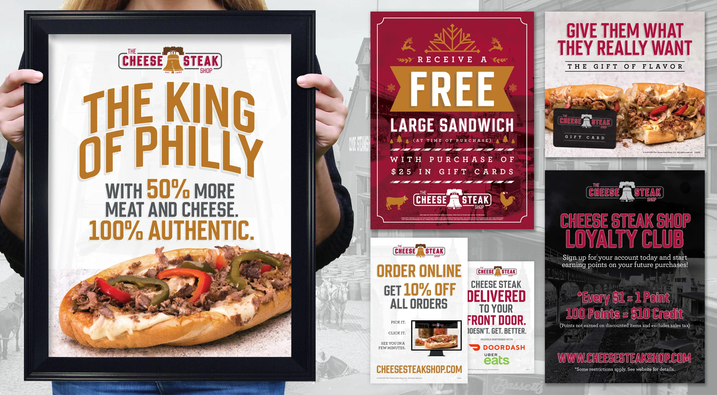
POSTERS & FLYERS
PEOPLE PACKAGINg / VESSEL


BOMBER BAGS
Packaging for The Cheese Steak Shop began with, what I affectionately refer to as, the Bomber Bag and Vessel. I was informed by the client of bag stock and printing restrictions. The challenge: strict 2 color printing, so I used the simplified versions of the logo. I created a black cup to pair with a white bag for a strong visual contrast between the two bold pieces.
Sandwiches run long at the restaurant so customers are handed the bag lengthwise and not vertically, therefore running the logo horizontally not only made the most sense, it was visually stronger.
The red checkers reflect tiling in the restaurant, a hold over from the previous interior design/brand, which the client wanted to keep. I used the checkers in the tagline mark and wanted to pull the element into each packaging item; a nod to vintage greasy spoon design.
CARRY-OUT BAG

BOMBER BOX / FRY SWEATER / VESSEL

STORE PACKAGING
WWW

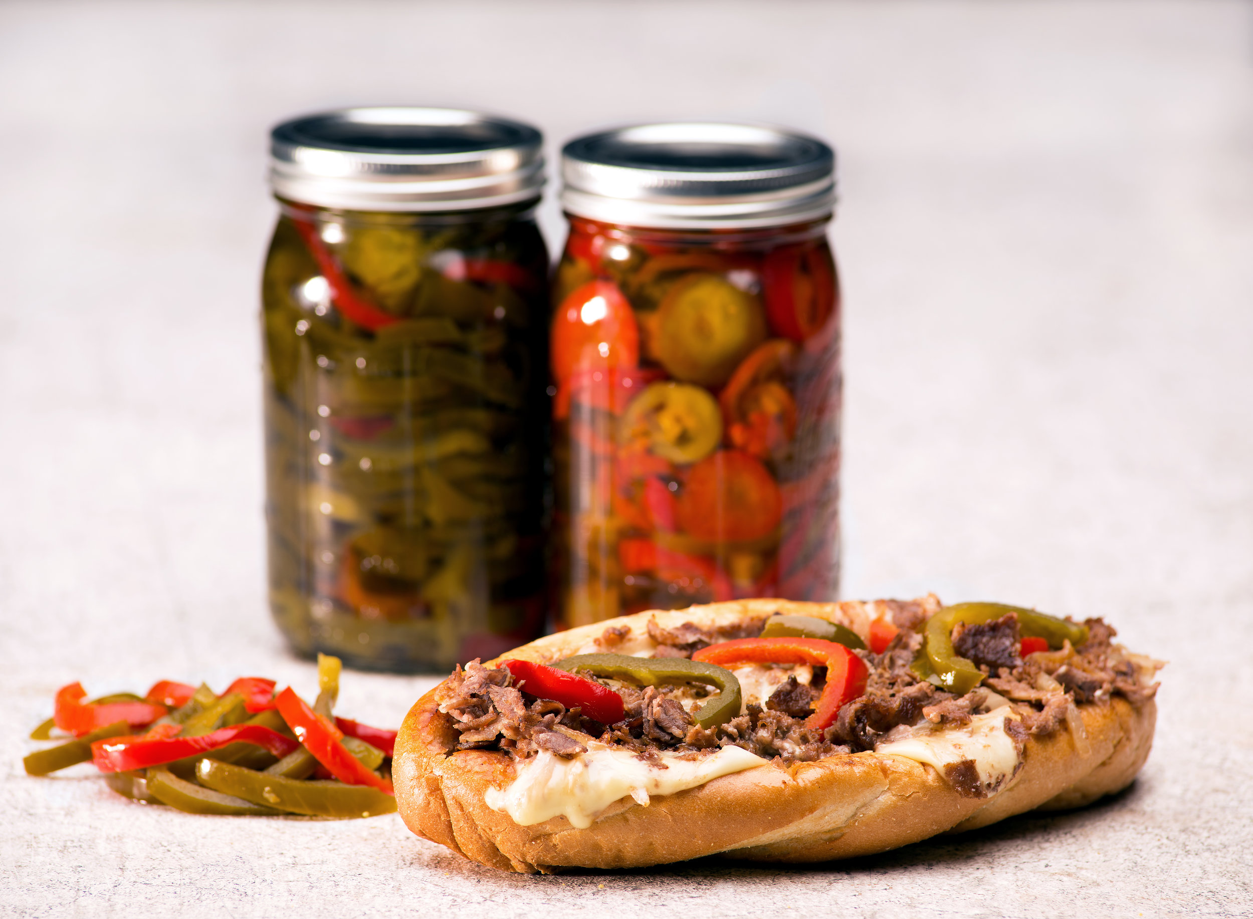
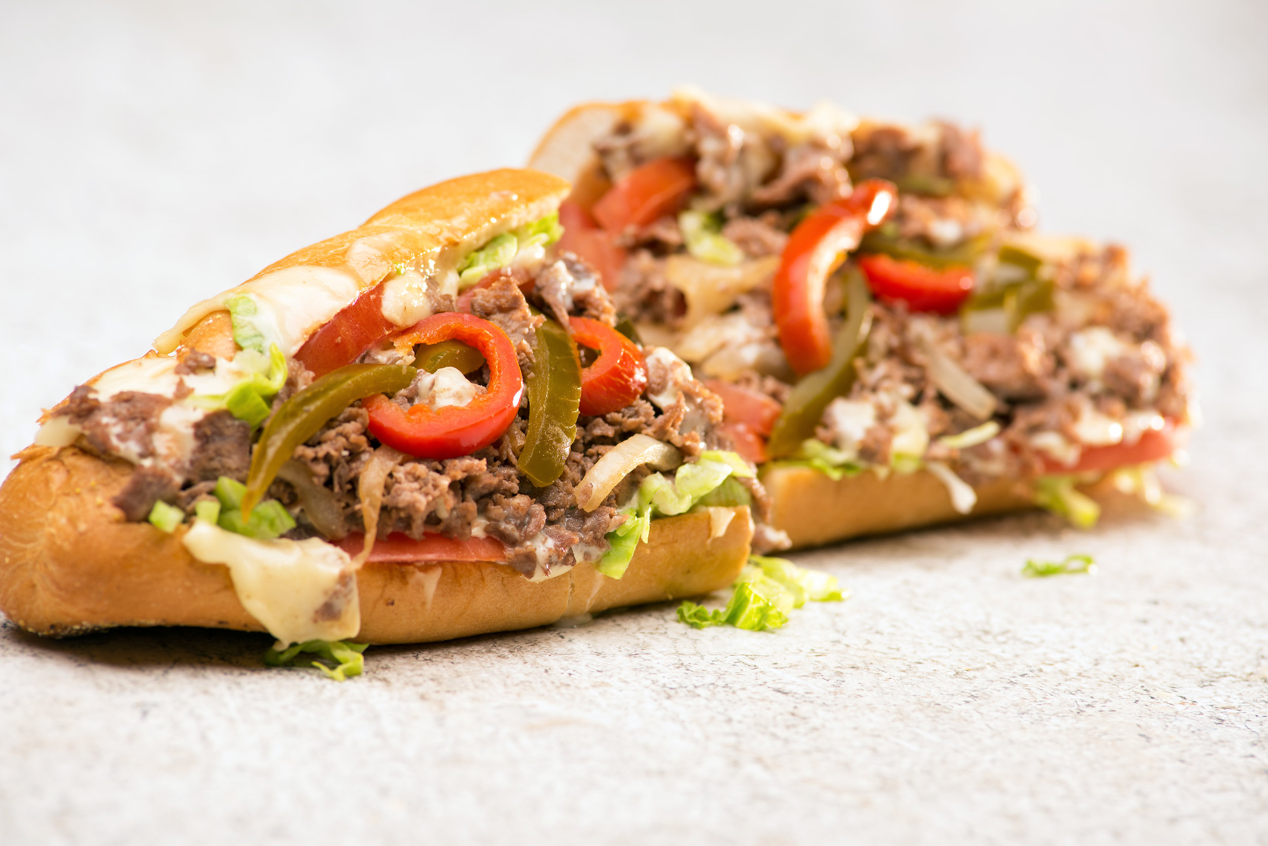
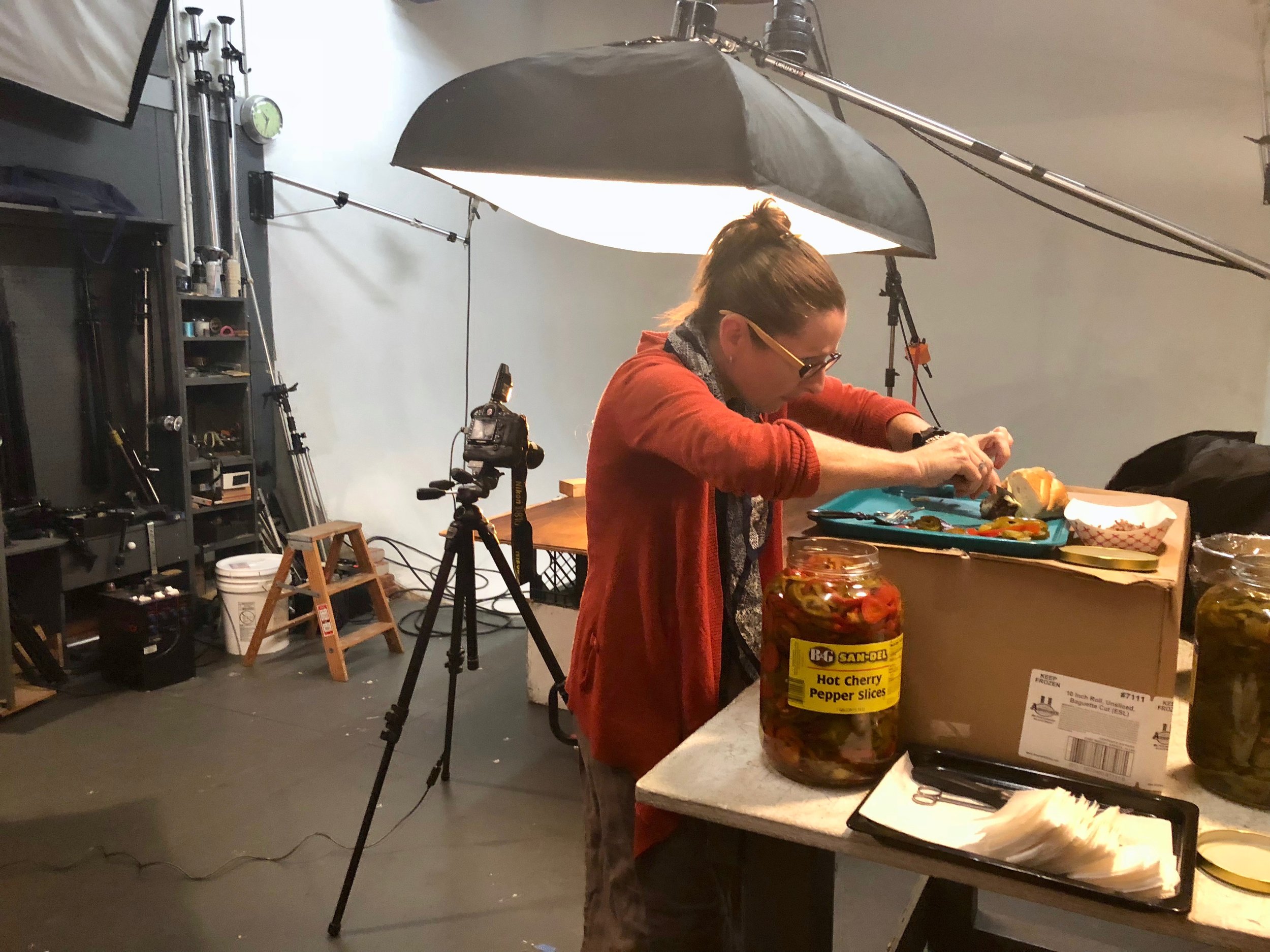
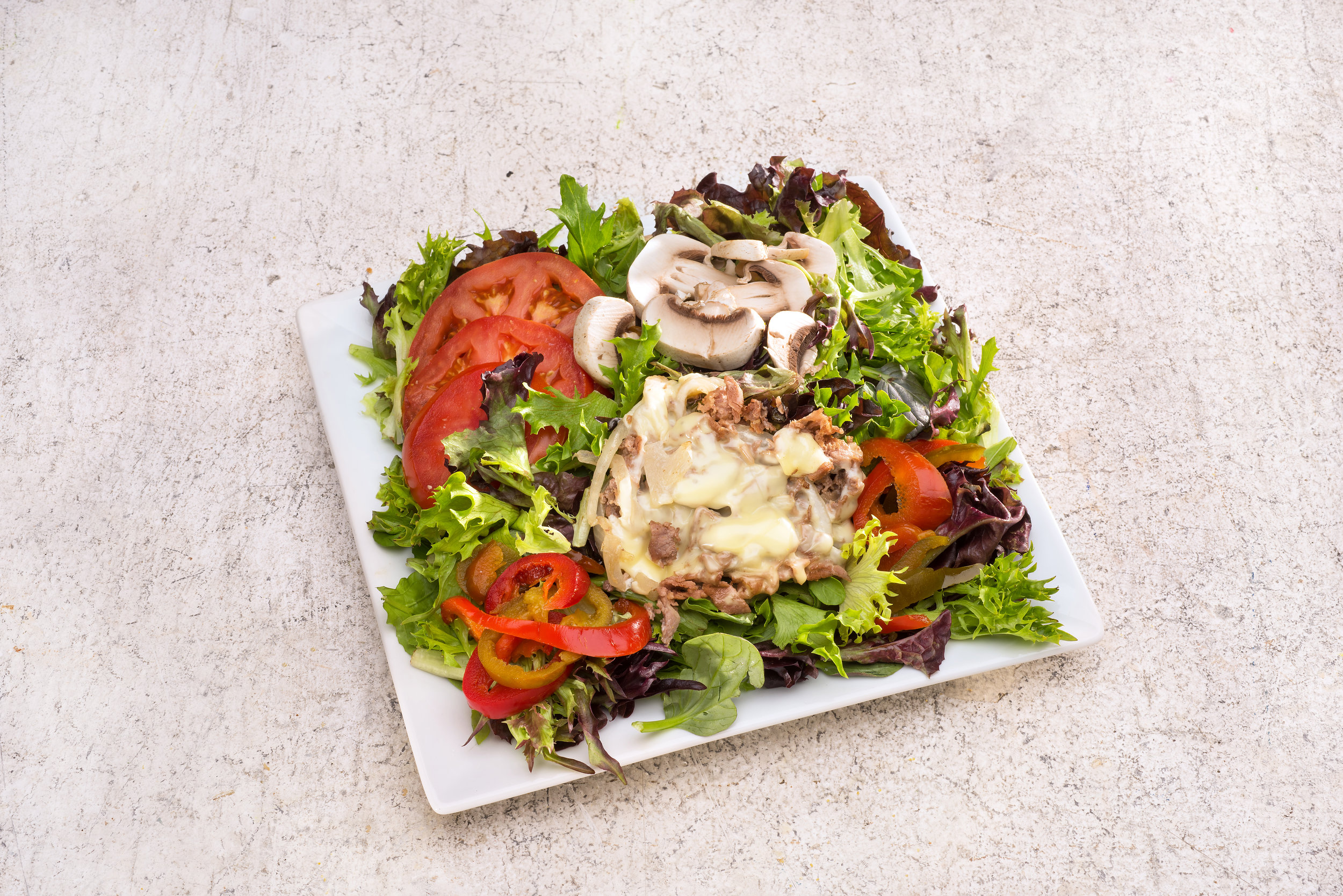
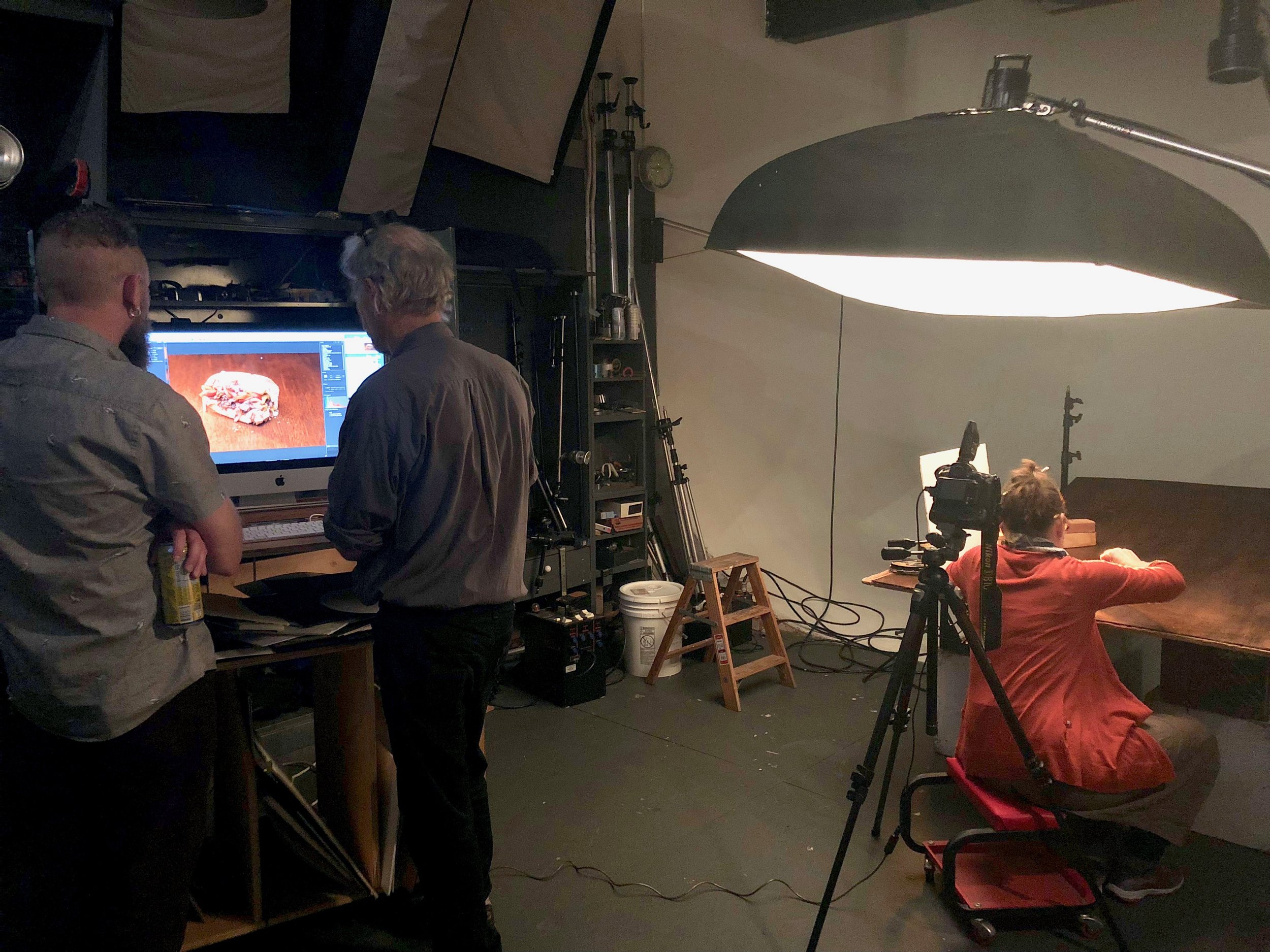
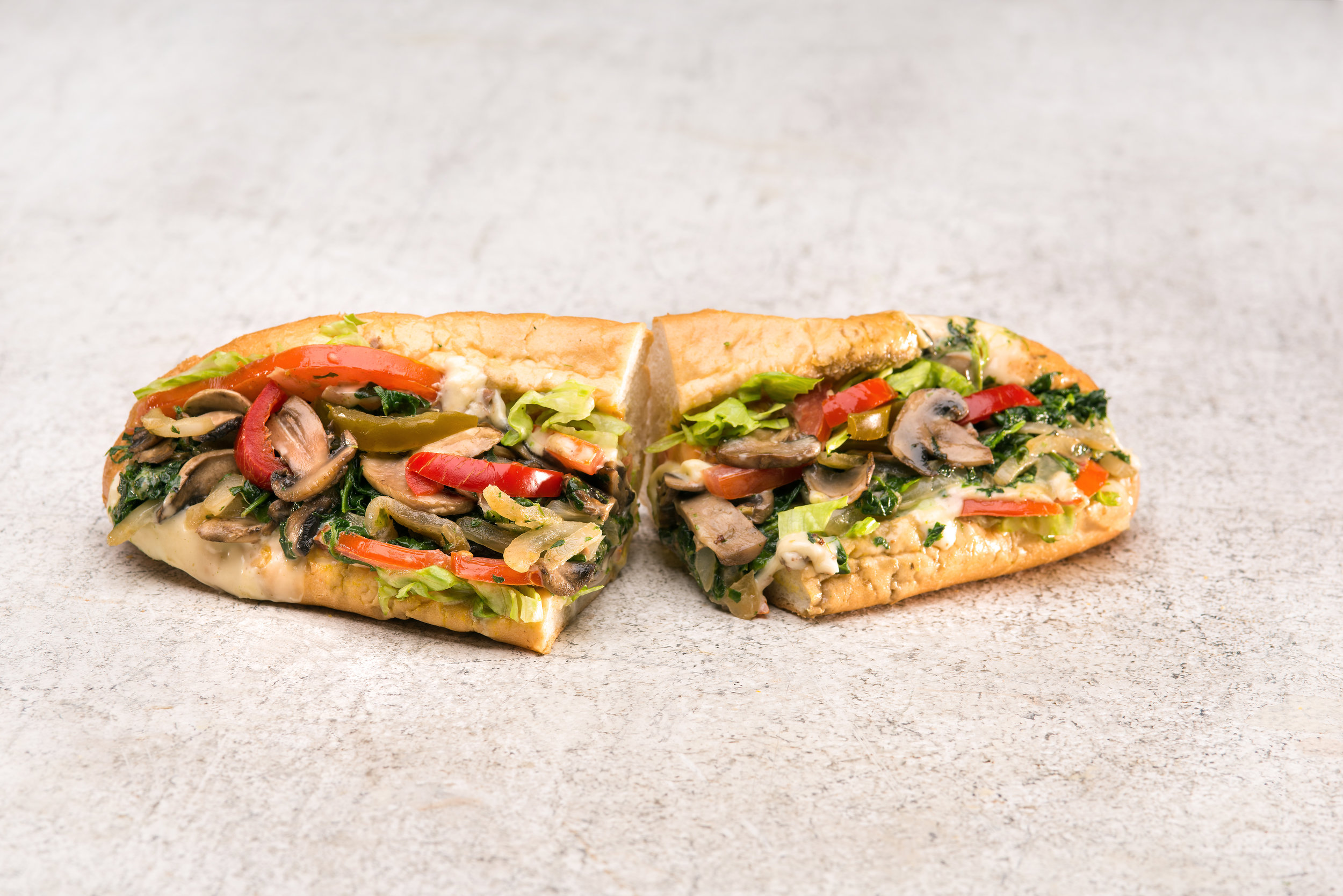
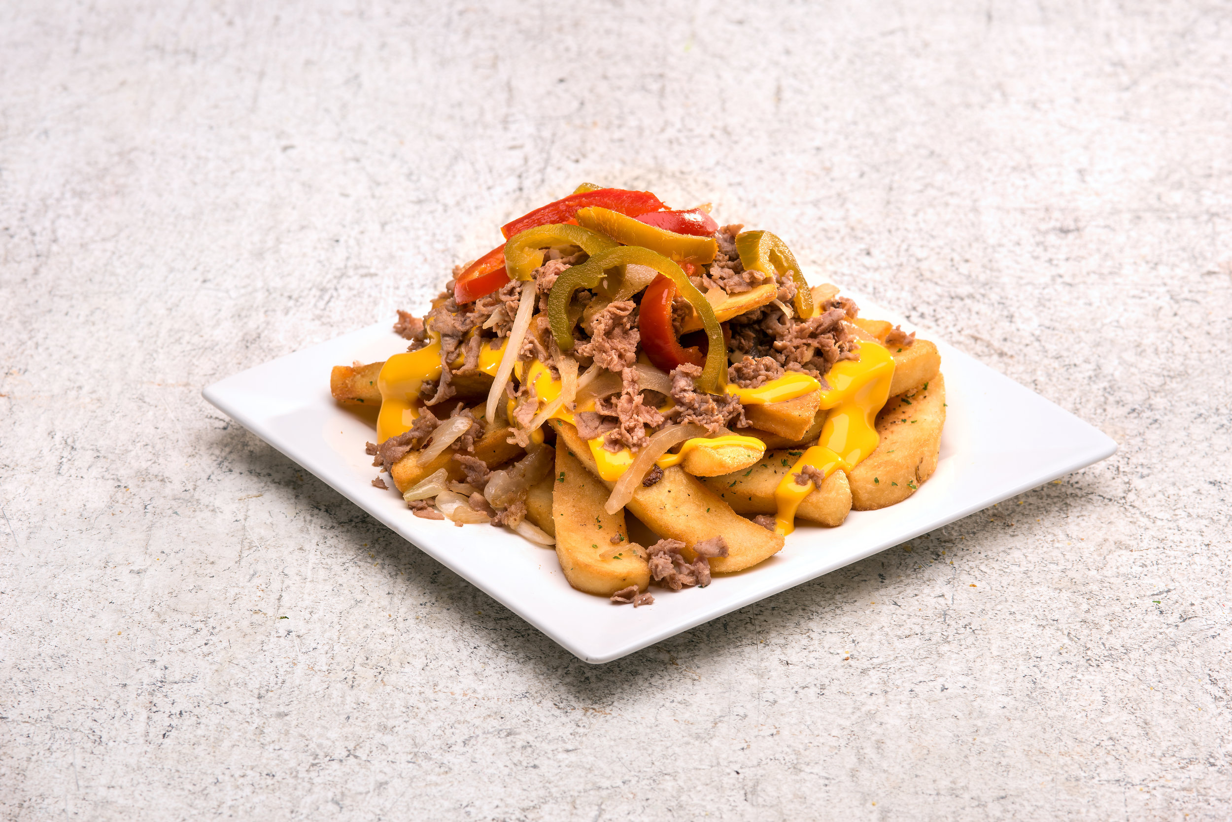
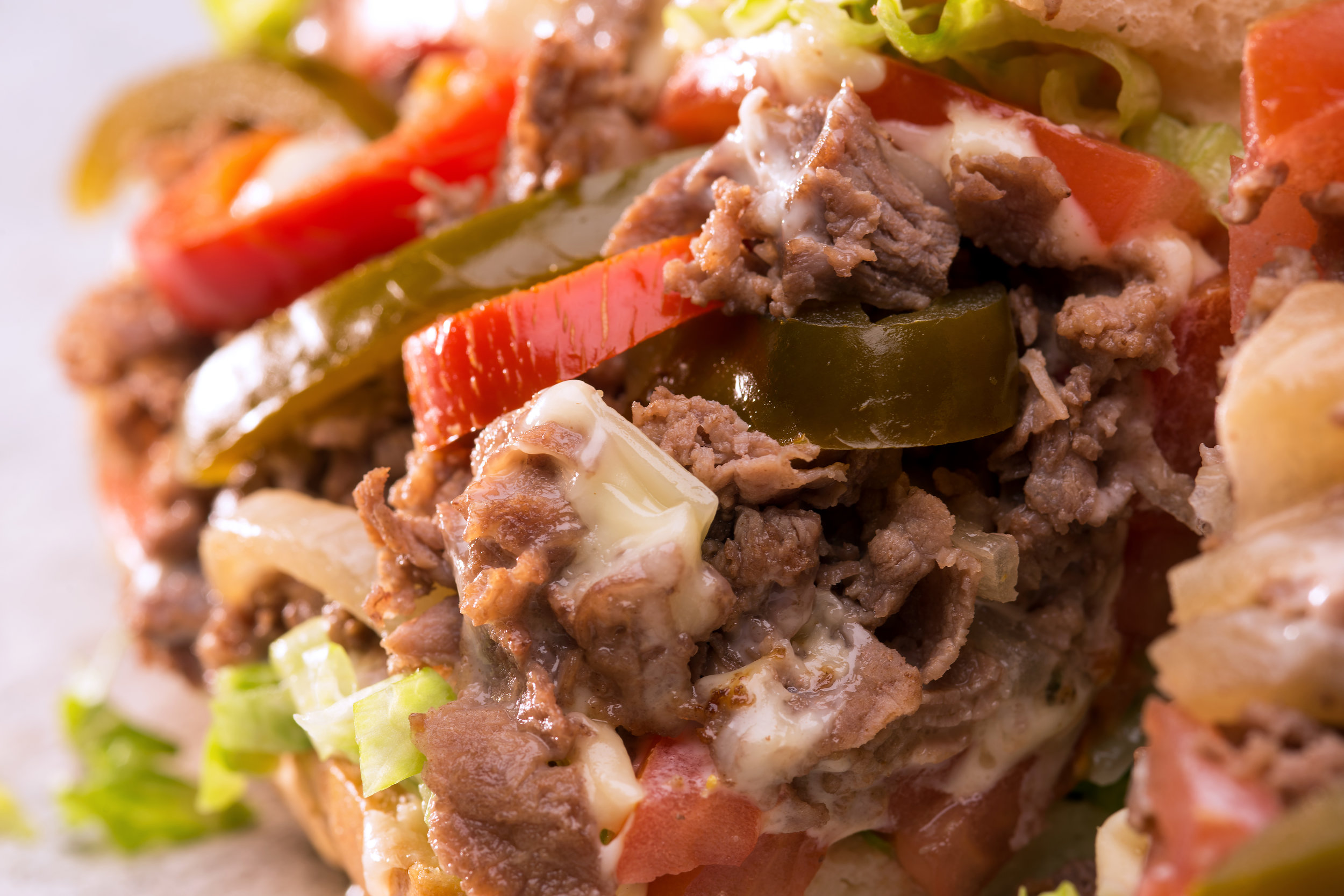
Product Photography Shoot
After the core look & feel was established, new food product photography came next. I had the pleasure of art directing the shoot, working with the client, photographer, food stylist, cook and account rep, the shoot ran incredibly smooth and efficient. I wanted to create an atmosphere where everyone contributed their ideas—equally—and had a blast at the same time. I’ve always believed if you truly have fun doing it, the final product reflects that and becomes stronger.
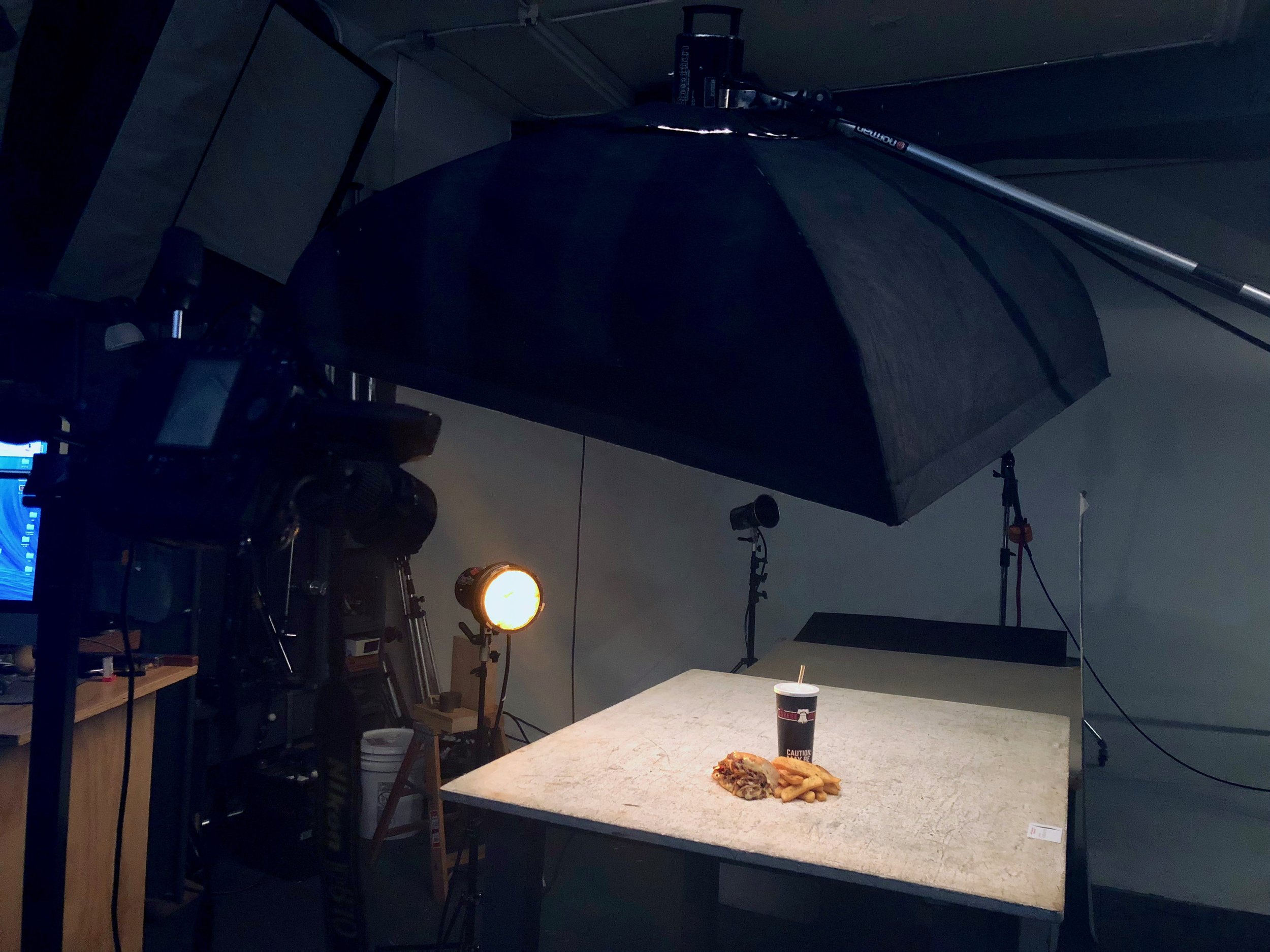
One challenge: the surface the photographer preferred lacked contrast and I didn’t feel fit the brand. I convinced the photographer to use, in his words, “my old dirty work table?!” then I proposed looking at both options side by side. After a quick glance I asked the client if he would like to shoot on both surfaces so we had flexible assets afterward. Client insisted on using the white surface, solely. Collectively, the entire team was able to produce quality images that paired perfectly with the new brand.
Date: June 28, 2018
Role: Art Director / Photo Editing
Photographer: Paul Schraub
Food Stylist: Diane Gsell

Initial surface

My suggested surface